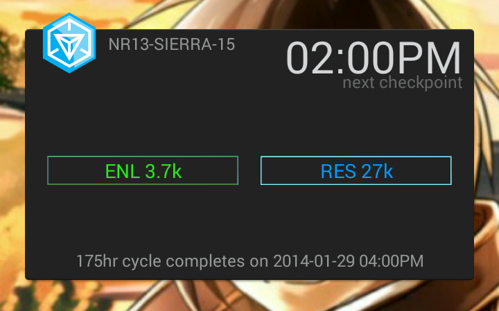
Currently it is quite limited and not very appealing from the design point of view, but it does its work ok — shows current MU score for your region, plus time till next update.
It is 2×4 blocks large and space is used ineffectively. I would use 1×4 block or even 1×2 to save screen space, but there are no other sizes available. Simply resizing it eliminates stats from the view. Also, it will be good to see % for each faction as it better shows dominance. Even in-app Intel tab lacks % ratio now.
Clicking on it opens Ingress (though not Intel tab). Hopefully, it does not eat too much battery 🙂


